Zelda Wiki:Featured Picture Nomination


Here users can nominate and vote for Zelda Wiki's next featured picture. Featured pictures should:
- Depict a Zelda-related subject.
- Be properly sourced, categorized, and licensed using FileInfo.
- Be of a reasonably high resolution AND/OR
- Be of a high quality in terms of detail and rendering
- Meet all other criteria of Zelda Wiki's Image Quality Standards
For help on the correct format used to add nominations or votes, see the Featured Content Help.
Rules:
Scoring and conditions for passing a nomination:
- All nominations start with an initial score of zero.
- A supporting vote adds 1 to the score.
- An opposing vote subtracts 1 from the score.
- An image needs to achieve a score of +5 within 4 months of the nomination date in order to be featured.
- A nomination automatically fails if the score drops to -3.
Voting:
- You may only vote once on a particular image.
- You may not vote on any images you have nominated.
- Votes should be added beneath the relevant header (either support or opposition), with # at the beginning of the line. The current score must be updated to reflect this new vote.
- Supporting votes should include a brief message stating why the image should be featured.
- Opposing votes must specify how the image fails to meet one or more of the qualifying criteria described above.
- All votes MUST be signed using ~~~~. If you do not sign, your vote WILL NOT be counted!
Currently nominated
Twinmold
I was looking at the bosses of Zelda the other day, and this image caught my eye above a lot of other images. It's a really good image done (edited) by Markol, and one of few MM pictures I've seen which are truly awesome. --Felicia's Champion 05:42, 18 November 2008 (UTC)
- I really like this picture. There's something about Majora's Mask artwork for the characters and monsters that I really liked, and still do to this day. Ancblue52 05:01, 15 December 2008 (UTC)
- This picture has too much shadow and is too hard to see. It also doesn't have very good perspective making the giant Twinmold look small.--Link hero of light 01:51, 4 December 2008 (UTC)
Well... Majoras mask artwork tend to have a little to much shadows and this picture is not an exception. But it doesn´t feel right to oppose it because it isn´t a bad picture... Well... Just wanted to say it... Wait, I change my mind. This, of all the MM -artwork, does not have too much shadows, it is great. So come on everyone vote for this picture now... -Olle93 20:21, 25 November 2008 (UTC)
- The image has been tweaked to fix the problem with the shadows.User:Matt/sig 06:56, December 15, 2008 (UTC)
Now it's worse! I liked it much better with the shadows!--Link hero of light 01:05, 17 December 2008 (UTC)
- Well, then. Don't complain about it then. You can either like it with shadows or without. Not both.User:Matt/sig 00:15, December 30, 2008 (UTC)
I don't like it either way, but I prefer the it with shadows.--Link hero of light 06:56, 4 January 2009 (UTC)
The shadow style is just a part of Majora's Mask art style. Nothing wrong with that. Although I don't really like Twinmold, and the image is kinda small I think. The Goron Moron 07:04, 4 January 2009 (UTC)
- If it didn't have the shadows, it wouldn't be Majora's Mask ;)--User:The Sage of Cosmos/sig 07:06, 4 January 2009 (UTC)
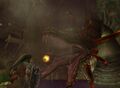
Morpheel
Okay, I was asked to nominate this one. It is a good image. It is large and highly detailed. It's pretty good. Worthy of being featured.User:Matt/sig 19:54, November 19, 2008 (UTC)
- A lot of detail has gone into this image, even though it wasn't one of my favorite bosses its still a worthy picture.--Makar11 19:34, 2 December 2008 (UTC)
- B I enjoy the flavour of the colour it presents an old apperance--Zanramon 20:11, 2 December 2008 (UTC)it has detail and its nice
- We do have alot of Twilight Princess pictures featured but this a very detailed image.--Link hero of light 01:51, 4 December 2008 (UTC)
- This image is an accurate reprisentation on how the boss looks ingame and is strikingly detailed--L285 19:16, 12 March 2009 (UTC)
it is very nice and detailedUser: link 6767
A detailed picture to be sure... but it is not a very interesting image and not the greatest boss. I do not believe it is feature-worthy.--HeroOfTheWinds10 19:40, 2 December 2008 (UTC)I agree, its a good picture and all but nothing is really going on its just Morpheel on a white background... Im sure if you tried looking you could find a more worthy picture of him to be featured but this one just doesnt cut it.--Kresh64 01:38, 3 December 2008 (UTC)
- Above votes negated per opposition guidelines at the top of the page. User:Ando/sig 01:53, 3 December 2008 (UTC)
I find the picture extremely boring. It doesn't show Morpheel's home terrain and looks fake because it's computer generated. It is highly detailed, but it looks like a sandworm because it's out of the water. Gives me the wrong impression, I had to do a double-take. --Pr3c1pit0us (Talk) 08:47, 5 February 2009 (UTC)
- Above vote negated per opposition guidelines at the top of the page. User:Adam/sig 19:19, 13 February 2009 (UTC)
Death Sword
I'm trying this again. Mostly because the image was updated since last time. I did some research. The votes against the old one were unfounded. Screen brightness has nothing to do with it. The real problem with the old in one was the loss of the glow and some color information in Death Sword itself. This new version is exactly the same except the darkest parts of the background are transparent. The new version is just a vibrant as the other. Except that is new really easy to see regardless of the screen brightness, unlike the old versions. This version is also huge. Actually bigger than the old one that is currently featured.User:Matt/sig 00:21, January 20, 2009 (UTC)
- This picture isn't all that great at the size it is now. But it's quite stunning when you enlarge it. It really should be replaced.--Link hero of light 02:02, 27 January 2009 (UTC)
- Though both versions of this picture look great, this new one is totally sweet! The mist surrounding Death Sword gives the image the ethereal quality that you would expect from a ghost. Truly awesome ;)User:Mandi/sig 04:43, 7 February 2009 (UTC)
- Death Sword was my favorite TP boss, and that pic is awesome! It really shows more of it's face.--SethOmega 04:42, 10 February 2009 (UTC)
- As with the Faron picture from before, this image is far superior than its unrendered predecessor and should replace it as a new featured image. Mases 20:54, 18 February 2009 (UTC)
- I'm gonna have to support this. The render is extremely professional and worthy of featured picture. --DekuLink 19:03, 26 March 2009 (UTC)
I don't know how we stand on personal opinion when it comes to New Images Vs Old, but I'll take a risk. All I can say is the background of the old one is half the reason I like it. The new one does look good, but I still like the old more more than this one. --Felicia's Champion 09:01, 23 February 2009 (UTC)- Above vote negated per opposition guidelines at the top of the page.User:Matt/sig 00:36, March 1, 2009 (UTC)
- The new pic makes Death Sword easier to see and makes it seem more solid, therefore taking away some of the ghostly quality that it should have since it's just that,a ghost.--Bolter1 05:56, 25 March 2009 (UTC)
I don't want to make anyone upset or complain too much (it is because of that I didn't write this as an opposion) but once again, this is just the same picture with a swap of backgroundcolor. The same thing applies on the picture of Faron that became the new featured picture. --Olle93 23:09, 1 February, 2009 (UTC)
- Change of back ground color can make a world of difference but, this image had more then just a "back ground color swap". For one, the old image was slightly cut-off (this one isn't), and the new version is larger, not to mention easier to see :)User:Mandi/sig 04:28, 3 February 2009 (UTC)
- Well, on my computer the new version isn't larger, it actually seems a bit smaller than the new one, but maybe that's something that's just wrong with my computer... Anyway, I kinda think that the old backgroundcolor was better for a "dark" monster like death sword. --Olle93 18:15, 3 February, 2009 (UTC)
Tingle's Rosy Rupeeland
I think this is a great work of art from TRR, and it shows the complete nature of the game, along with some rare images of our favorite characters. It is an enjoyable piece of work, with a light-hearted atmosphere.—Alter {T C B H } 21:56, 31 January 2009 (UTC)
- Well at least this is better than that other Tingle image above. This appears to be in a good size too, but that's all I can really say. The Goron Moron 06:32, 1 February 2009 (UTC)
- Yeah, I like that all the birds are wearing the same clothes as Tingle...Olle93 23:01, 1 February 2009 (UTC)
Previously featured
(Voting Archive) (Failed Nominations)
-
Reuniting Kafei and Anju (August 5, 2007)disqualified -
Twilight Princess Illustration (September 12, 2007)
-
Ocarina of Time Soundtrack Cover (October 29, 2007)disqualified -
Wind Waker Illustration (November 19, 2007)
-
Midna (December 16, 2007)
-
Faron (January 6, 2008)disqualified -
Death Sword (January 21, 2008)
-
Link's Awakening Art (January 27, 2008)
-
Stained Glass Window (February 3, 2008)
-
Sheik Brawl (February 14, 2008)disqualified -
Link's piggy pals (February 16, 2008)
-
Majora's Mask Official Art (February 18, 2008)
-
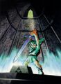
Young Link claims the Master Sword (March 24, 2008)
-
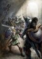
Link versus Darknuts (March 26, 2008)
-
Diababa (April 2, 2008)
-
Link versus Miniblins (May 9, 2008)
-
Minish Portal (June 11, 2008)
-
Ocarina of Time Poster (July 10, 2008)
-
Twilit Igniter Fyrus (August 6, 2008)
-
Adventure of Link Sword (October 3, 2008)
-
Dark Link (November 13, 2008)
-
Link and Big Key (December 12, 2008)
-
Big Chu Chu (January 10, 2009)
-
Faron (January 31, 2009)


